From the beginning of this staircase makeover, adding a molding design on the tall staircase wall was a high priority.
This is the first wall we and our visitors see when opening the entrance door. I wanted to fill that large area in. I knew a molding design would add style and warmth to this vast space.
Hello there, welcome!
Here's a quick recap of our recent projects at RLC.
The second floor of our home got a refresh: The walls and ceiling in the hallway and two rooms were patched and painted. We replaced the carpet on the entire level with solid hardwood floors. The staircase also received a complete makeover, and I'm excited to share all the details about planning and installing the staircase molding.
Let's take a look at the starting point.
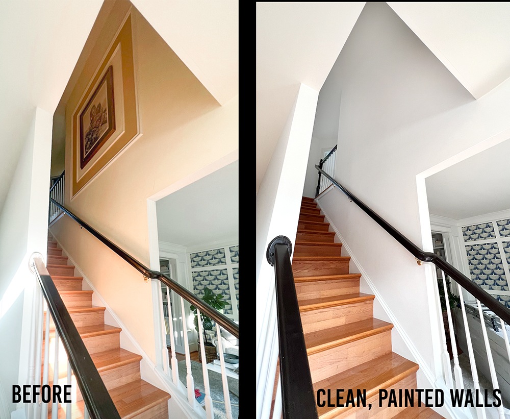
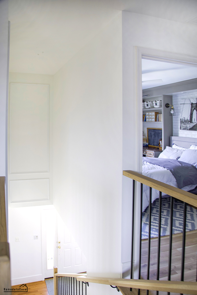
The "before" picture on the lower left shows the double picture frame I installed a while back. A testament to my early love affair with molding! (We've all been there, right?). :D
The right picture below shows the wall prep for the molding - without the frames and artwork and with two coats of BM Chantilly Lace paint.
*This post contains affiliate links for your convenience. Click here to read my full disclosure policy.
This vast expanse of emptiness demanded attention.
While eagerly awaiting the crew's arrival to replace the staircase, I used the time productively to brainstorm the molding design.
TOOLS AND MATERIALS
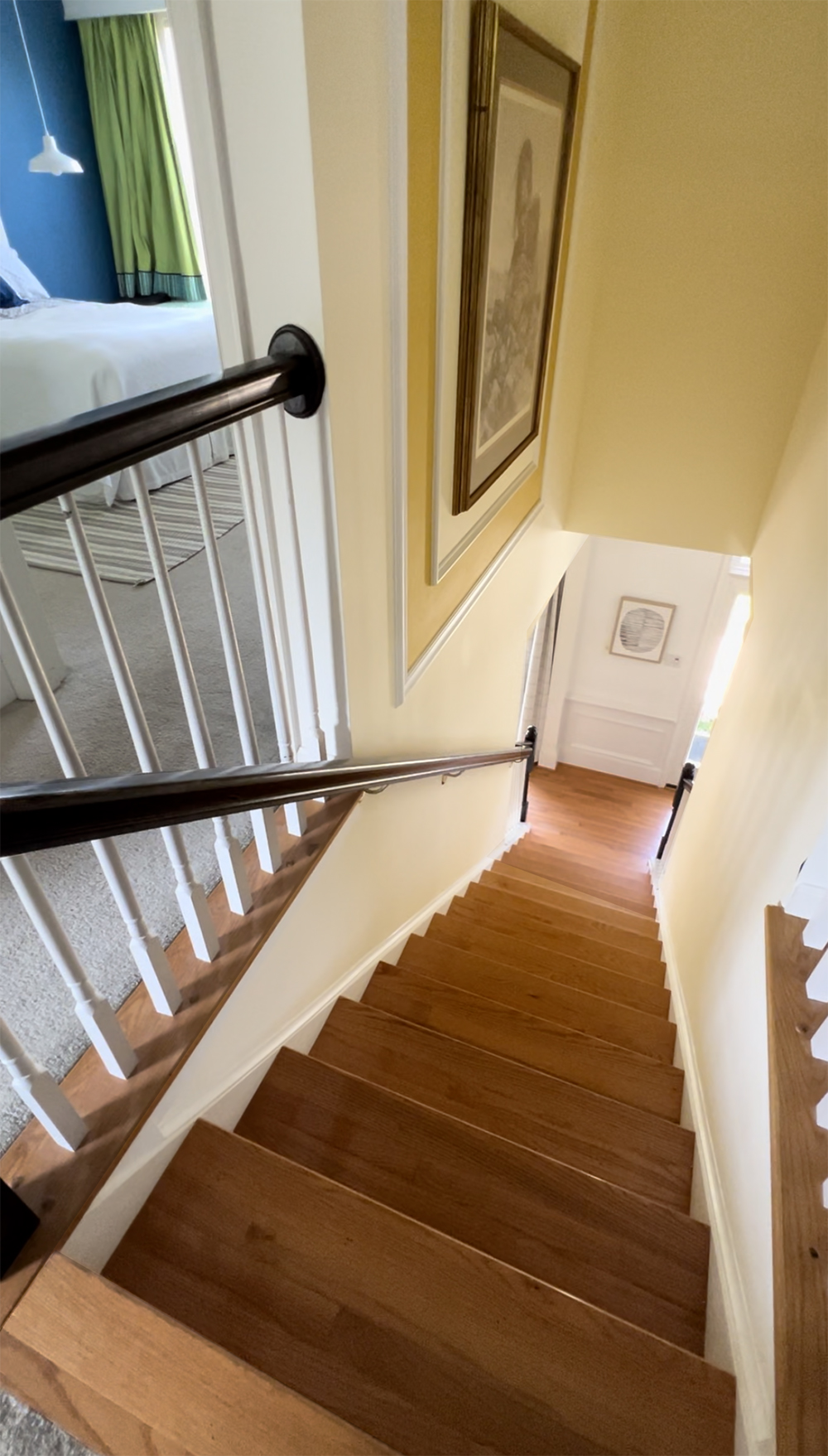
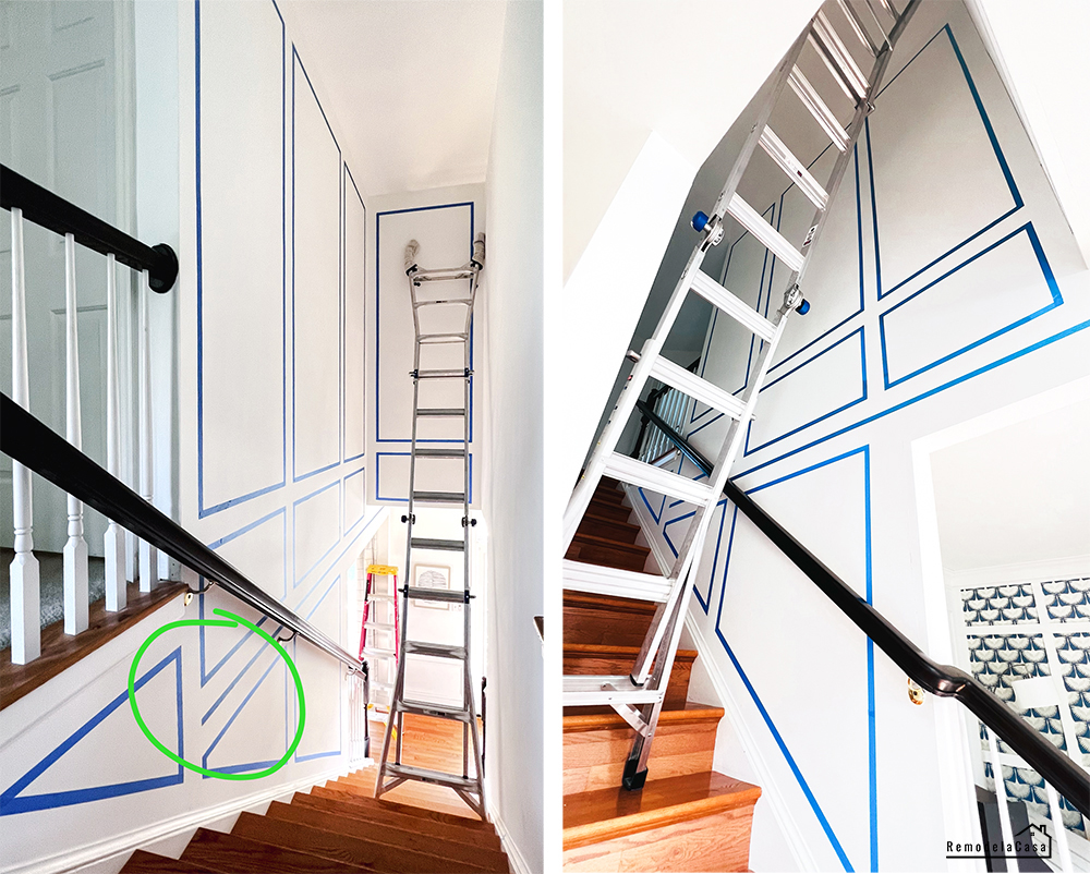
The following pictures are the top and lower views of that first design.
If you're thinking about adding a molding design to your home, the following are some of the tools and materials that you might need:
- Tape Measure
- Laser Level
- Painters tape
- Ladder
- Brad nailer
- Nail set + Hammer
- Hand saw - better yet, Miter Saw
- Caulking
- Wall molding
THE PLANNING
Working with painter's tape is a no-brainer. You make your design, and you can change it easily, many times, using the same tape you just peeled off.
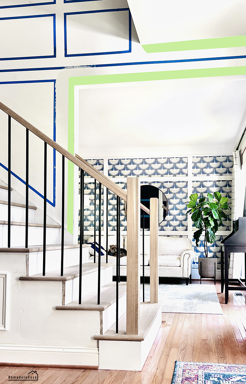
I started my design with that horizontal line from left to right in the picture below. That line represented the wall molding I installed in most rooms on our home's main level.
If you pay close attention to the crown molding in the living room, there's another molding right above the top edge of that wallpaper. I was recreating that line here.
The green areas represent the crown molding and the door frame that needed to be installed.
Above that single-line "division," I created a trio of long and short rectangles on the main wall. I simply followed the lines on the lower part to fill that space.
A set of long/short rectangles on the back narrow wall was all that narrow space needed.
It all looked very OK, especially from below, looking all the way up.
However, I didn't like the division line going to the top left corner. It was stopped before hitting that final triangle on the left.
Nope. I didn't like it. The design was heavy and too busy.
This main wall is weird. The living room door creates an open space in the lower right corner. Then, on the opposite side, in the top-left corner, another open space for the top railing.
CHANGING THE DESIGN
It was time to go up that ladder and reconfigure that design.
The three frames on that main wall looked OK from the bottom of the staircase, but I didn't like the top view because the rear-end set of rectangles was added to the equation. Standing on the top floor, I could see four rectangles.
I wasn't even considering that ample empty space opposite the main wall.
I started to change things up and decided to remove one whole set of rectangles on that main wall.
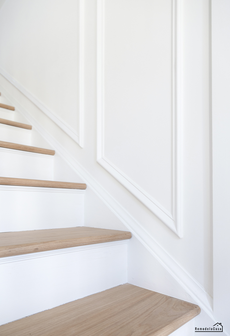
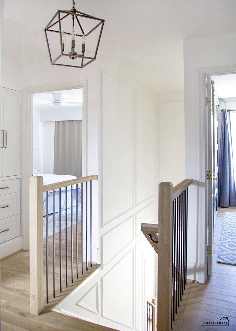
The end product is simply gorgeous!
I used only two sets of rectangles on that main wall and removed the division line.
The picture below shows you how it looked from the top to the bottom. It sure looked less chaotic, but what I also liked about this configuration was that I needed less material.
Another positive aspect of this design was its installation, as it took a lot of work to reach the middle part of that big wall with only a ladder, which is all I had.
I lived with this configuration for a few days, ensuring I liked it, before giving it the green line to install the molding.
My main tools for installing this small molding on the wall were my RYOBI nailer and 1-1/2" brad nails. I don't use glue on this type of molding. The nails and the caulking will hold these wood molds very well. Besides, if you want to change it, the damage to the wall is minimal.
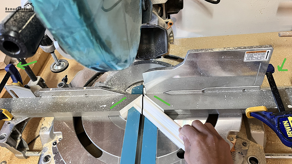
I used my miter saw to make the 45-degree (miter cuts). All this material was repurposed from wall moldings I had installed in the 2000s in our family room. I removed these pieces when the built-in was installed, but they were saved in the garage until now. :)
The moldings were cleaned up, sanded, and painted before installation.
THE DOOR TRIM
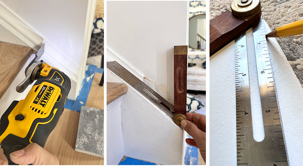
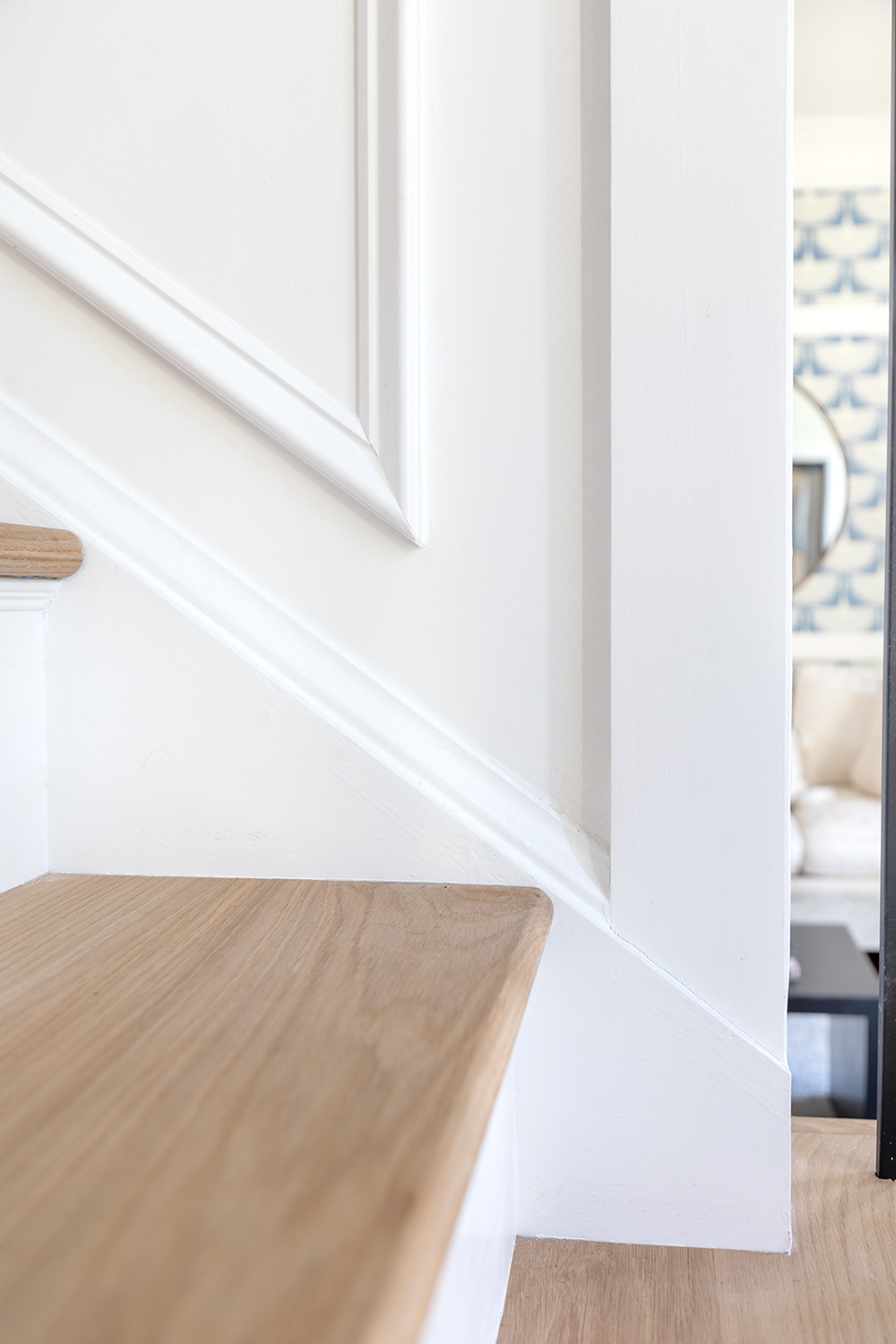
Trimming the door involves using the multi-tool to cut the base mold. Then, the angle was measured and transferred to the stile with a T-bevel angle finder.
By the way, I learned how to make angle cuts beyond 60 degrees, which is what my saw can handle. For some configuration, I had to deal with 83-degree angles!? Yeah, I had no idea how to cut them.
This quick tip from this guy here is incredible and works like a charm!
Yep. The door trim needs to be completed, and I need to install the crown, too. Someday, someday.
The molding was painted with the same BM Chantilly Lace paint in a semi-gloss finish, while the wall had a flat finish.
This narrow staircase has only 38" of space from wall to wall. Removing a chunk of wall on the lower part of the staircase opened up that entire area.
Please let me know your opinion about this issue.
Except when I take pictures like the one below:
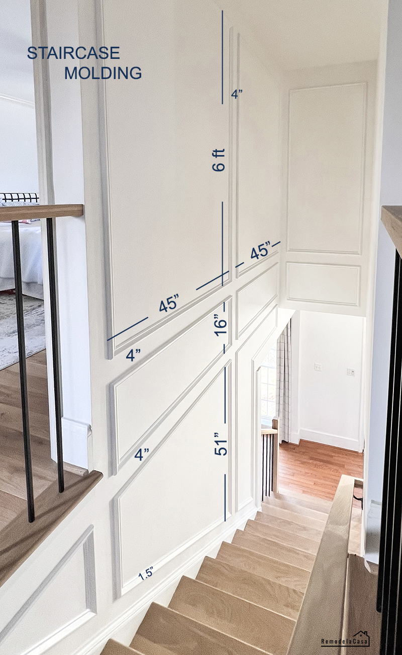
As usual, I'd like to leave you with the measurements of this design so you can better understand it in your own space.
The main wall was divided in the middle, but the extra areas (top-right and lower-left designs) balanced the entire design.
Now, my big question for you all is this:
Should I replicate the same molding design on the opposite wall?
I skipped it because I didn't have the material at hand. Also, given this is such a narrow area, it can look too busy.
That wall gets little attention. I hardly even notice it.
Thank you so much for stopping by!
Have a great weekend.











This looks amazing…I know how long you have want to change this stairway. Yes, unfortunately, I think you should do the opposite wall! But like me I bet you are always on the hunt for another project, so there you go! Beautiful as always!
ReplyDeleteThat's true, it only took us 20 years!! 😔 And yes, I'm always ready for another DIY. 😅 I better go and unpack that ladder.
DeleteI have watched you transform your home for years…as well as your families homes. Such talent! The molding turned out beautifully. I am of the thought to do the other side as well.
ReplyDeleteAnn, thank you so much for your kind words and your advice! It seems as you all agree with the need to do the other side. 👍🏼
DeleteThanks for this inspiration! your staircase walls are very similar to mine. We're about to put hardwood upstairs too. What flooring did you use and what color is that?
ReplyDeleteHi, thank you! All the info about the hardwood floors is this post: https://www.remodelandolacasa.com/2024/03/solid-hardwood-floor-installation.html
DeleteThis is gorgeous and I’ve been looking to do something like it…well hire someone, I cannot do myself. Could you possibly tell me a range on cost for something like this? Thanks so much, enjoying seeing your talents at work!
ReplyDelete