The makeover of our powder room was in its final stage. A planked ceiling was installed, a vanity was built, and the walls were patched and painted glossy black. It was time to give the vanity area a good style punch by stenciling a pretty hexagon allover design.
Wall stencils are a great way to give your room a fabulous pattern or design on a meager budget compared to other alternatives, such as wallpaper or tile; that's precisely why I chose a stenciled accent wall.
*This post contains affiliate links for your convenience. Click here to read my full disclosure policy.
Let me tell you about my experience stenciling this hexagon design in our powder room, my mistakes, and the lessons I learned.
Then, it was cut even more to fit other areas in the other corner. The last parts to be tackled were the four corners.
If you have never stenciled, the experts recommend avoiding using geometric designs, high-contrast paint options, and glossy paints.
Why?
An abstract is more forgiving than a geometric design when little mistakes happen or the walls aren't that straight. The same concept goes for high contrast & glossy paint treatments. Minor errors will be more visible when using those options.
I went against all those recommendations and still managed to come up with a rather great-looking geometric design in this bathroom!
You can watch the video or continue reading below.
PREPARE THE WALL
Patch, prime, and paint the wall in your chosen color.
I painted the entire bathroom in Sherwin Williams Tricorn Black in a satin finish. The sheen would help bounce the light to make this small space appear larger. Again, it is better to use flat latex finish paints for general stenciling projects.
Mask off the other walls, ceiling, switch plates, etc., before you begin stenciling.
The tools & materials you'll need:
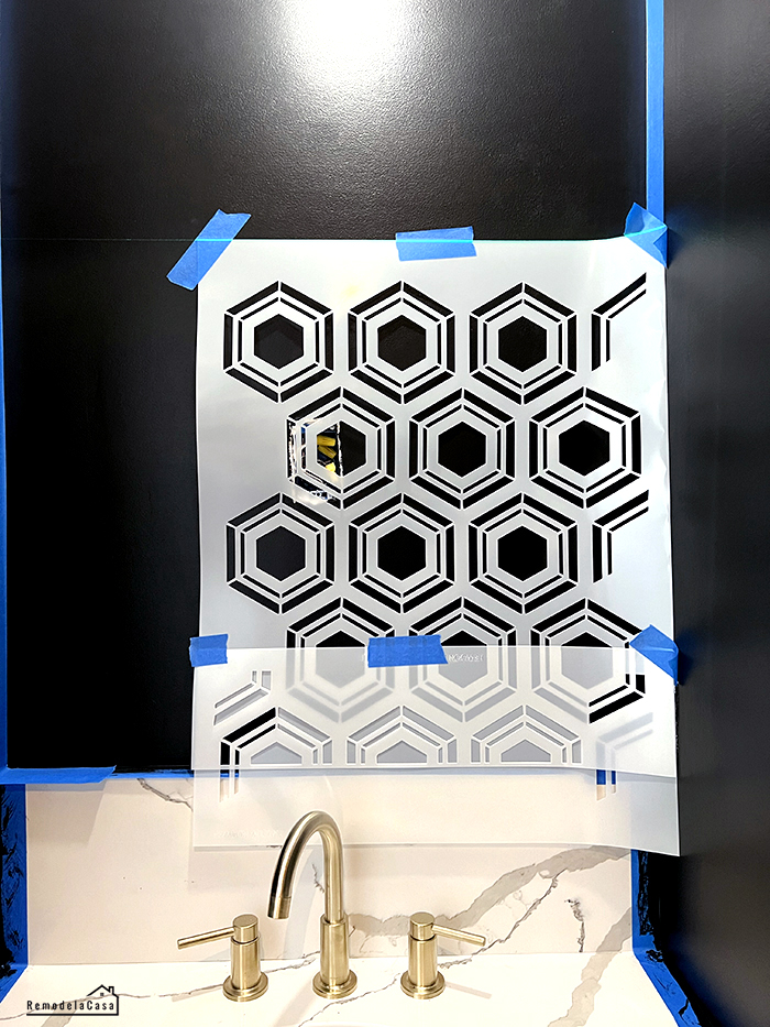
I used the Cutting Edge Stencils hexagon allover stencil, and I love that it comes with a free top and one single stencil included. That single hexagon stencil made this entire project way easier to accomplish.
Easy-Tack adhesive was sprayed on the back of the main stencil to get a better grip on the wall, easily reposition it, and prevent paint seepage.
DETERMINE THE STARTING POINT
A great variety of designs need to be centered on the wall; that wasn't the case with this hexagon design.
For this allover design, the main factor was ending up with both sides of the wall in a symmetric way.
Walls aren't straight; use a level to set the design on the wall. I used my laser level, which quickly set the horizontal and vertical lines to follow.
The picture below shows my way of measuring how to end the design on the lower part of the wall. The "top stencil" was positioned atop the main stencil as a guide on where to finish/start the design,
LESS IS MORE!
Regarding the amount of paint loaded on the roller, less is more. You need to load the high-density roller with paint, BUT... you need to get rid of excess paint.
I rolled the excess paint on an empty paper plate, then gave it a few passes on paper towels before bringing it onto the stencil.
PAINT THE DESIGN
Paint the design on the wall lightly, rolling the paint over the stencil.
Working those corners with this type of setup was a big no-no. I held the stencil with my free hand while bringing the roller closer to the corner, but it wasn't close enough.
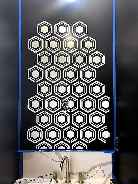
This is how it looked after two coats. By the way, those coats of paint are very light. The first part was already dry when I finished painting the last hexagon.
The stenciled was repositioned. This time, I ensured it stayed off the corners. Those corners gave me lots of trouble, but I finally figured out how to work them.
Before going to that solution, I had to paint all those complete hexagons.
SHARPER PAINT LINES
Painting with a high-density roller went fast, but it didn't give me any razor-sharp lines. Maybe the roller was carrying too much paint?
It's possible. Even though I rolled it plenty of times on the paper towels, it was almost dry when I brought it to the wall.
At this point, I changed my strategy and started using stenciling brushes in a dry-brush technique. Once again, the brush had to be loaded, but you need to get rid of excess paint by dapping the brush onto paper towels.
Some people paint in a circular motion when using brushes. Instead, I used the stippling method, dapping the brush onto the stencil openings.
Stippling sure takes longer, but the lines are very sharp. Using a bigger brush would've been even better.
A SINGLE STENCIL
Working with a big stencil on a small wall like the one I tackled was a nuisance. I was so glad to have this single hexagon included with this design!
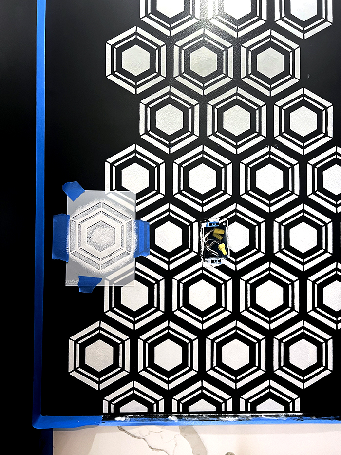
I first trimmed both sides of the single stencil so each side could be positioned right in the middle of the top and bottom hexagon designs already on the wall. It worked like a charm. So much easier for these areas closer to the corner.
TRIM YOUR STENCIL TO GET RIGHT INTO THOSE CORNERS
My solution to reaching those corners without trouble was to use a paper cutter to trim that single stencil as I went along.
You need to identify the most complete hexagons and trim the stencil to fit that wall area.
After painting all the "complete hexagons," the stencil was trimmed to fit this spot in the picture below.
Instead of dealing with a humongous stencil that doesn't vent nicely, this was a phenomenal solution.
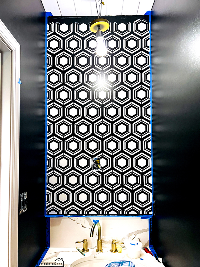
Here, almost done! I had to go get the ladder to reach the top.
A new line of painter's tape was set opposite to create crisp lines on that backsplash.
You can see those little imperfections up close, but overall, I'm delighted with the result.
I love my new powder room!!
Check out all the projects tackled in this powder room makeover!
*This post contains affiliate links.


I absolutely love this! Makes me want to redo my powder room!!!!! Beautiful!
ReplyDeleteThanks Beck! Those tiny rooms are fun to redo.
DeleteI love the boldness! Great job on stenciling!
ReplyDeleteThanks so much, girly!!
Delete