It's time to reveal this tiny powder room! It took me almost ten years to return to this bathroom to give it a brand-new look. But it's done, and I love its new modern take!
Powder rooms are the one tiny space in our homes that can withstand bold decorating choices, and I took that statement to the T to give this private dwelling the wow factor I hope my guests and family will cherish when they step inside.
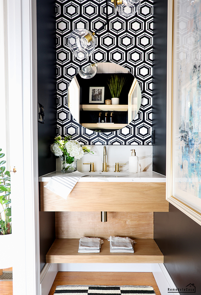
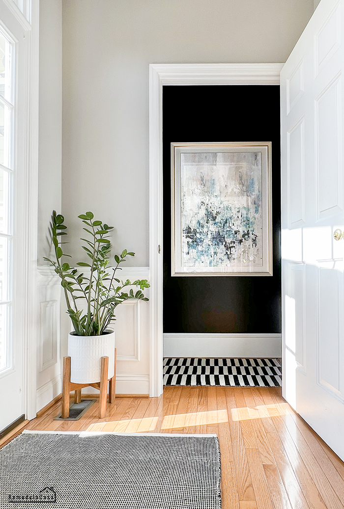
As seen in this first picture, I went to the dark side.
Yep. No more boring white walls.
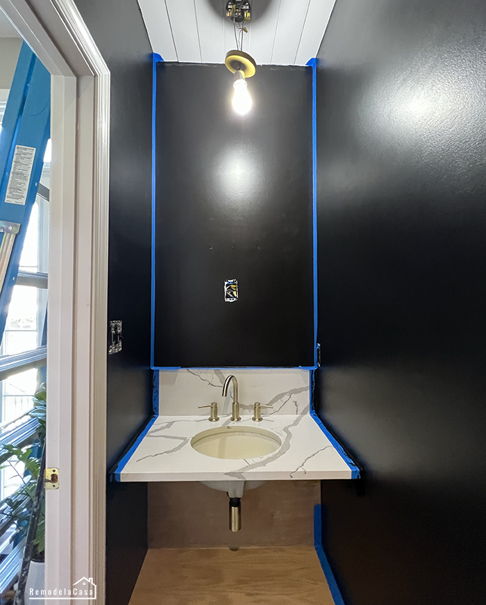
I again went for a bold treatment, painting all the walls in this little room black and adding a stenciled feature wall.
*This post contains affiliate links for your convenience. Click here to read my full disclosure policy.
If you're a regular, you know I've already completed a few DIY projects in this room: a new planked ceiling, a floating vanity, and a recessed toilet paper holder. Now, it was time to paint those walls.
The new wall color is Sherwin Williams Tricorn Black in a Satin finish.
The ceiling and trim color: Behr White in a Semi-Gloss finish
Painting the walls in black was a bit scary, but I knew it would work if I used the correct type of paint with a good amount of sheen to help bounce the light.
I have to tell you that it totally worked!
The first compliments I received came from each of my kids, who separately told me how the room felt much bigger. 😉
Complete details about painting a room in a shiny black tone are HERE.
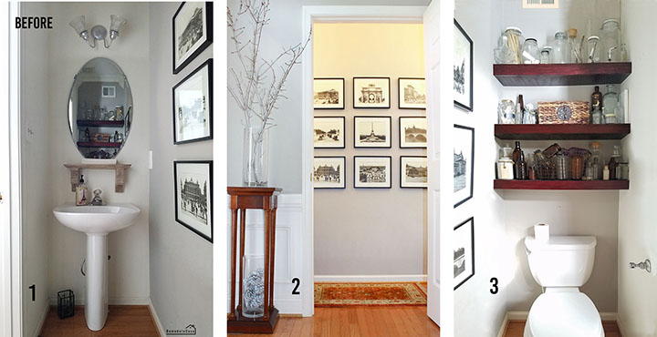
But hey, let's get to all the juicy details, starting with the tired before. This bath is a small box 32" x 7' x 9' high. Ha, it was a little lower after installing the planked ceiling.
It consists of three main areas, as you can see in the picture below:
1. The sink/vanity area
2. The main wall or what you see when standing in the foyer and
3. The back area where the toilet and the floating shelves are located.
1. THE SINK / VANITY AREA
The pedestal sink has been with us for over 20 years, but I was ready for something new.
The oval mirror and the light the hubs installed backguards were also here when we moved in.
The new vanity area is just awesome!
A STENCILED FEATURE WALL
| Mirror | Pendant Light | Rug |
This floating bathroom vanity is a reasonably easy DIY project if you have a small enclosed area like mine.
The Calacatta quartz countertop, with its pretty gray veining, is one of my favorite features in this bathroom. I love that it's maintenance-free and stain-resistant, and not even counting all the space I now have around the sink. It's priceless!
I chose a high backsplash—9"—and I'm delighted that the fabricator flawlessly continued the veining design between the two parts.
| Sink |
I used white oak plywood for the vanity construction, and I couldn't be happier with that decision. Wood grain is the natural element this bathroom needs.
I finished all the wooden pieces with three coats of matte Poly, sanding with 320-grid sandpaper in between coats.
NOTE: The back wooden board behind the P-trap (picture below) is a 1/4" plywood underlayment. My initial plan was to also paint the stenciled design onto this board, but the more I lived with the all-wooden vanity, the less I wanted to bring the bold design below the countertop.
As I pointed out during the vanity build, this 1/4" plywood is removable, so I might change it to 1/4" white oak to better match the grain with the other pieces.
Since this powder room makeover began, a feature wall has been a high priority. I first thought of installing peel-and-stick wallpaper, but I didn't go with that idea because the plastic nature of the P&S wallpaper somehow makes it look cheap.
There's nothing wrong with that; I've used this type of wallpaper in many rooms. However, I wanted something better in this bathroom, where we'll be "face-to-face" with that treatment.
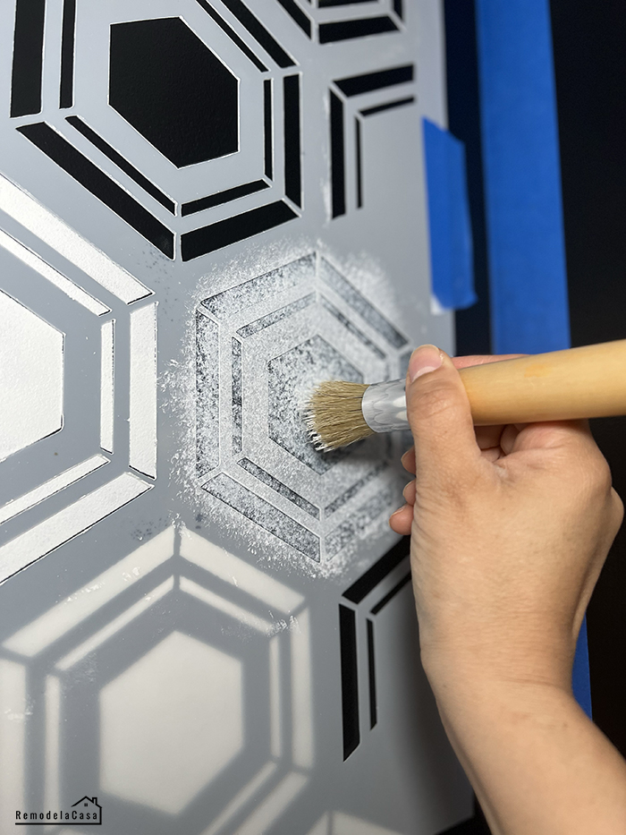
Then, I considered installing tile, but I didn't want to commit to a pattern, and the thought of removing it later made me go and check stenciled designs.
I fell in love with this hexagon design. It looks like tile. I'm preparing another post with more details about this room's painting and stenciling.
The shelves were given a mini-makeover, and the black paint makes them pop!
| Hexagon Stencil |
ADD MORE LIGHT WITH A LIGHTED MIRROR
Getting the correct mirror for this powder room took me quite some time, but in the end, I succeeded with a mirror that gives a soft glow around the area and, most importantly, on your face.
I first tried another mirror with a lighted front band all around the mirror, but the light was too intense. I had to return it.
The light from this new mirror is installed on its back. It illuminates the wall and bounces to the front. The LED light is dimmable and controlled with a touch switch. It's anti-fog, and the best part is that it's also hardwired. Each time we turn on the light switch, the mirror and the lights go on. However, you can also use this mirror with a plugin they include.
GIVE IT MORE LIGHT
The white-planked ceiling keeps things bright up there. However, the 2-light cluster pendant's modern minimalistic design brightens the entire space.
I like the design, price, and how this light works in my space. However, I'm not fond of the gold finish; it's painted and dull.
2. THE MAIN WALL
A gallery wall with a set of Paris prints was what this wall sported for many years. I loved it, but it was time to say goodbye to it.
When the bathroom door opens, this is the view from the foyer after stepping inside the house's main entrance.
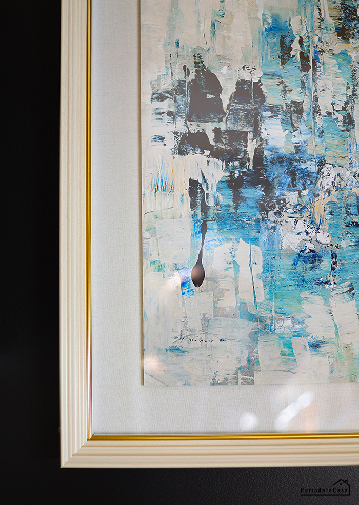
I didn't want another gallery wall, so I got this beautiful abstract art at HomeGoods. I adore the white frame with the tiny gold detail against the black wall. The print's blue, taupe, and black tones are the dash of color this bathroom needs.
It also ties in with all the blue tones I've added around the house, especially in the opposite living room.
3. THE SHELVES & TOILET AREA
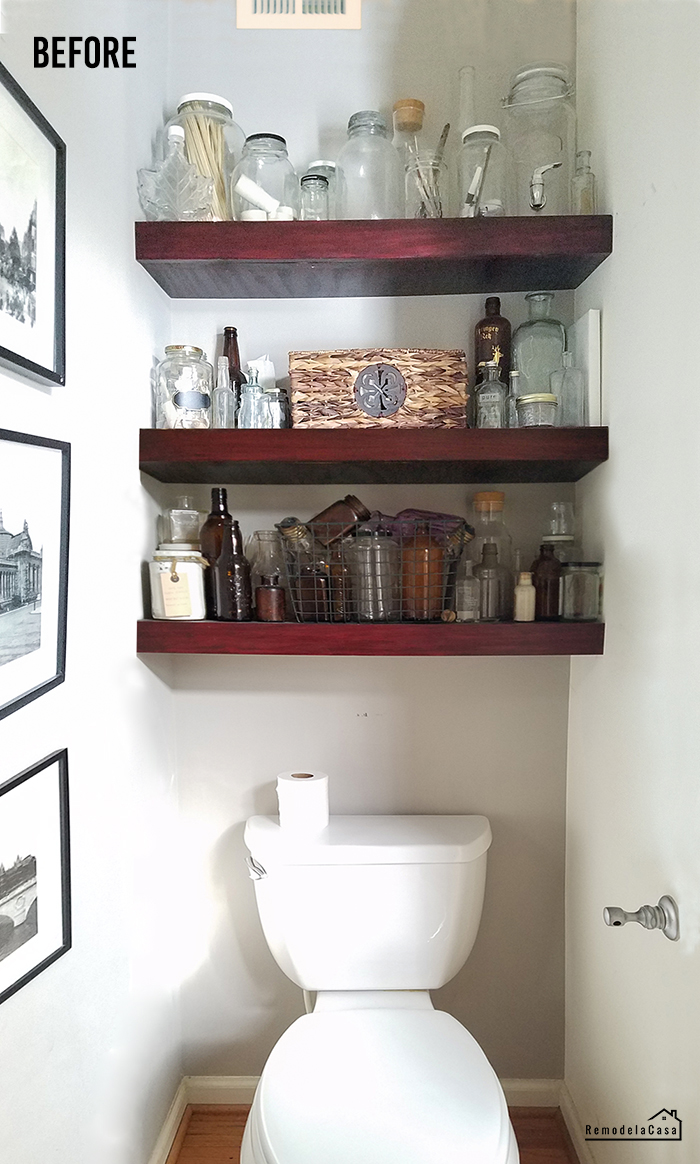
The floating shelves were a DIY project that I tackled many years ago. I used them to display my old bottle collection, which kept growing and made this entire area look too messy.
THE AFTER
I also installed a can light on the ceiling, and I adore how it brightens up the space and highlights all the pretties on the shelves.
When decorating shelves or bookcases, I prefer to use faux plants. If I use natural plants, they tend to be forgotten.
I kept a few pieces from my bottle collection. 😅
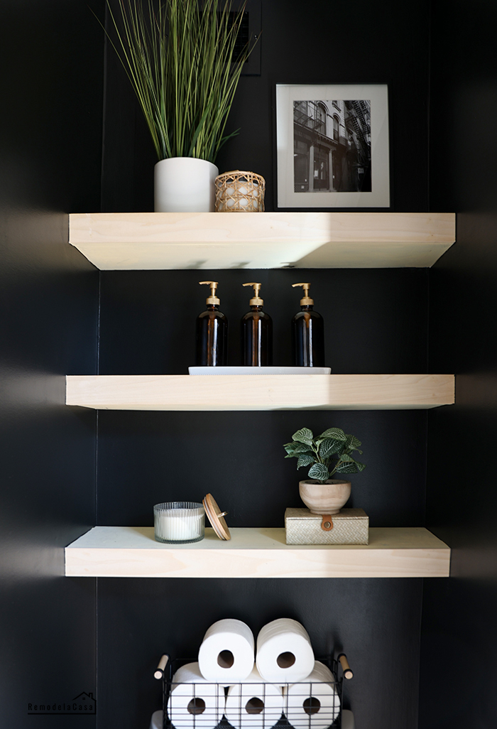
I went for a less-is-more kind of approach to style the shelves.
| Candle | Woven Box | Faux Plant |
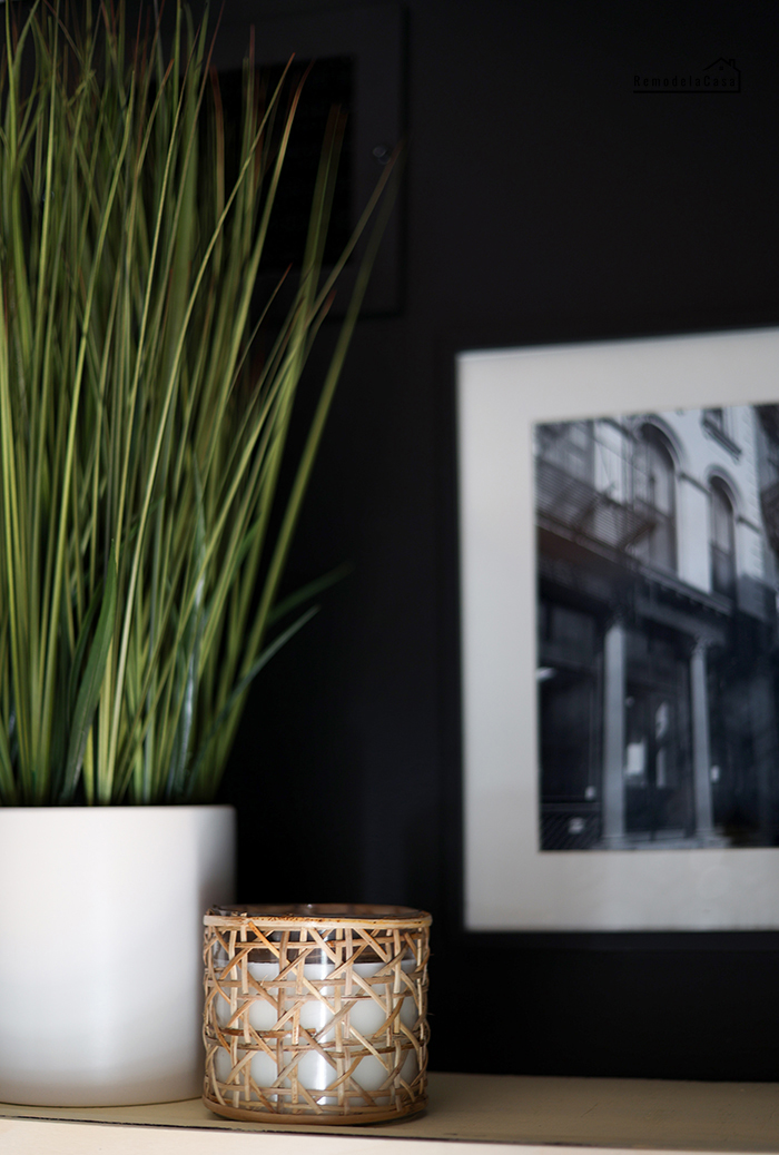
| Faux Plant | B&W Print |
The pumps on these soap bottles were painted gold; now, they make a statement on the shelves.
Several toilet paper rolls are stored inside a wire basket atop the toilet tank.
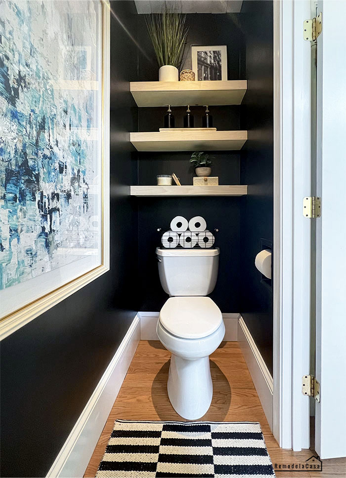
A comprehensive view of that back area with the floating shelves.
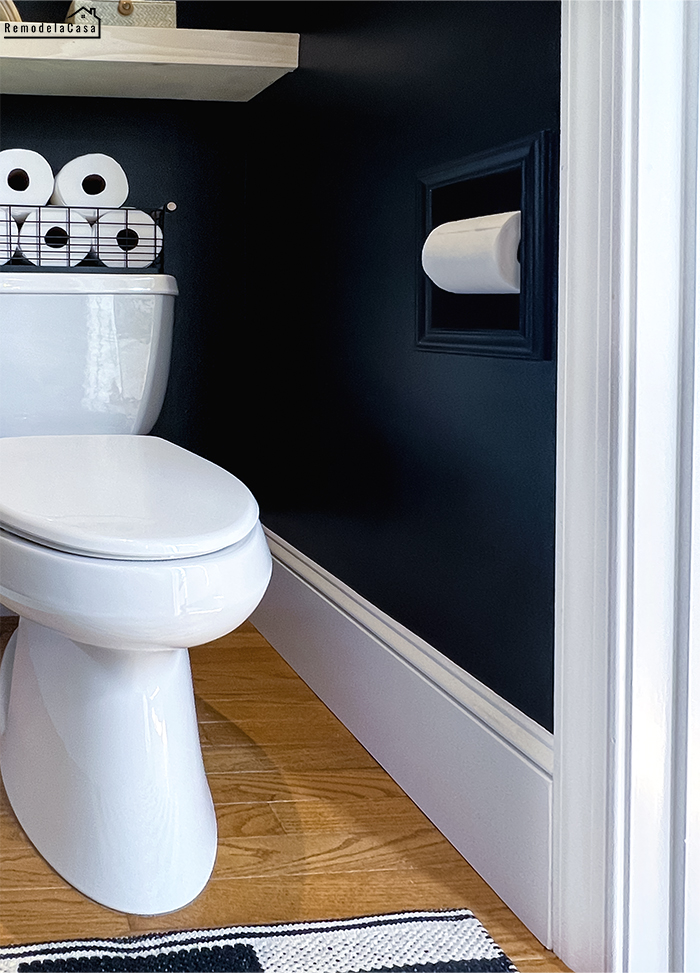
Oh, and there is the DIY - recessed toilet paper holder. I like how it looks painted black.
Well, that's all that's happened in this little powder room!
Let's take a final look at these three main areas.
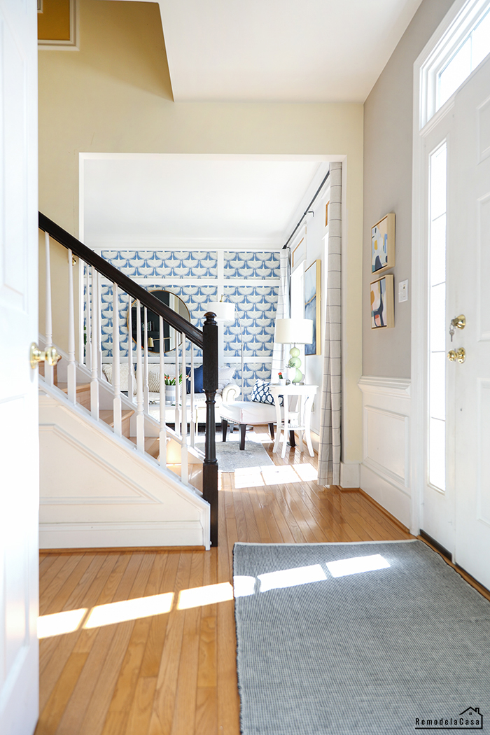
First, while standing by the staircase in the foyer.
And my favorite view while sitting on the loo. 😂
I'm still amazed at how awesome my new iPhone 13 is for taking wide shots.
Thanks so much for stopping by!
I hope you've enjoyed this tiny powder room makeover and that you can draw some ideas to put into practice in your own project. I'm still working on a small video about this makeover. As soon as I finish it, I'll post it.
A rough estimate of the total cost of this makeover is $1,700, which includes all the materials (countertop, ceiling planks, etc.), decor objects, and the price I paid for plumbing. Not included in this price are the tools, wooden materials like 2x4s, nails, and primer I had at hand.
It would mean the world if you could share this project on your social media channels.
Thanks!
Source List:
Here are all the projects tackled in this room:
*This post contains affiliate links.













This looks amazing! You did such a great job with the stencilling, and I also love the floating shelves and really everything about this room!
ReplyDeleteHi Jeanine, thanks!! We're loving it. 🖤
Deleteit looks awesome! Love the new sink
ReplyDeleteThanks so much, Morgane! Yes, the sink is nice and deep and all the real estate around it is 👌
DeleteOh MY Gosh this is gorgeous, I'm in love with this space 😍
ReplyDeleteThank you!
DeleteYou are SO amazing Cristina. Every project you touch is a winner. This is outstanding!
ReplyDeleteRita, you're as always SO very kind. Thank you!
Delete