We visited the store at the end of Spring and it was completely different. The color scheme has changed drastically. I love how Ikea keeps on changing its room displays, there's always something new every time I visit.
Well, let me take you all along!
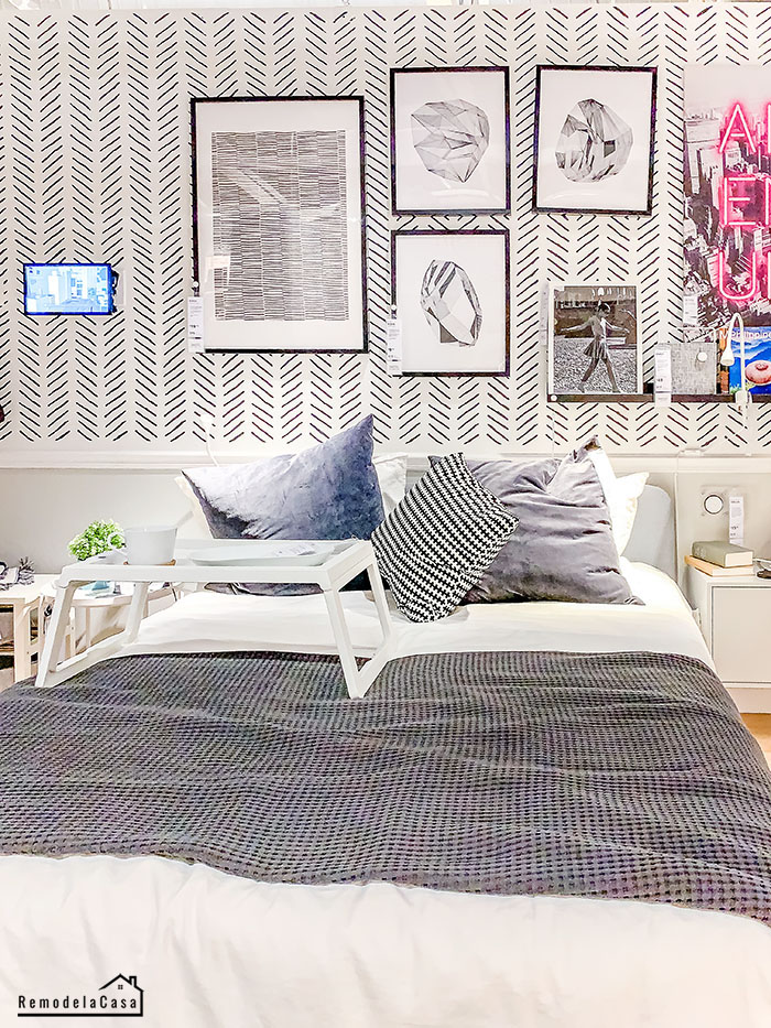
This first post is all about the bedrooms and living spaces. This moody bedroom with that awesome gallery wall really caught my eye.
I love the brick wall in this room, a great backdrop for all the black accents. The chunky textiles make it even cozier.
While all the drama and contrast of moody rooms are driving us crazy - in a good way - That's not the only option Ikea has.
For us, white room lovers, they also have awesome inspiration. Here, is a classic white and black bedroom with a transitional twist thanks to the wallpaper.
The pink continues in this room below, this time adding some more color to it. I like how the sheer curtains divide the room.
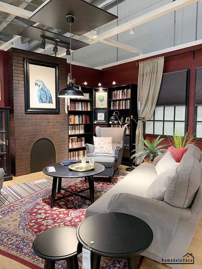
The living areas were also a mix of moody and bright rooms. This family room sporting that gorgeous burgundy color was another favorite.
I have a similar rug that I used in my family room last year. I was thinking of selling it, but seeing how popular those types of rugs are right now, I'm going to hold it a bit more. You might see it again during Christmas this year.
How about that sofa below? Would you buy a sofa sporting this pattern? I think is pretty, but I might get tired of it real soon.
Oh, and a couple of dining rooms...
I hope you have enjoyed this collection of beautiful rooms. Click HERE to check all the beautiful kitchens, bathrooms, and home offices I also captured!
So many pretty rooms! Which one was your favorite?


New comments are not allowed.