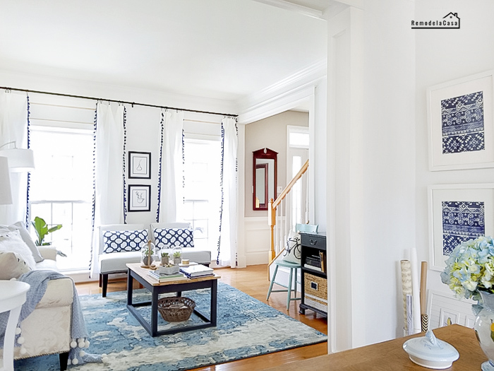
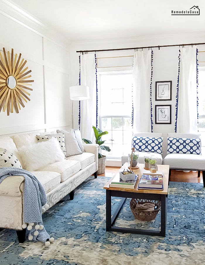
Last week during the Spring Home Tour I gave you the final shots of this, the newly renovated living room.
I didn't want to make you wait one more week, it was already a long wait since that day in September, remember? When I used some of the ugliest graphics to show you my plans for this room! :D
You can check that post right here.
Today I'm doing something that I love: before and afters.
Really, who doesn't love before and afters! It's good to see the changes done to a room just by scrolling down the page. ;)
*This post contains affiliate links for your convenience. Click here to read my full disclosure policy.
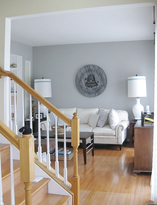
Let's start here, the before of the room when standing at the main entrance door. Don't pay attention to the stairs, that's going to be my next project. I hate those newel posts.
Right there was the main problem: The big wall where most of the art pieces were simply lost.
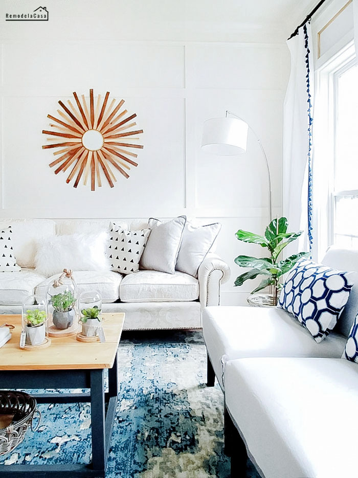
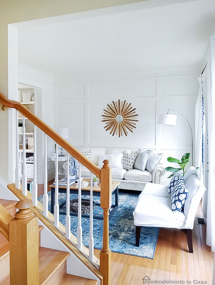
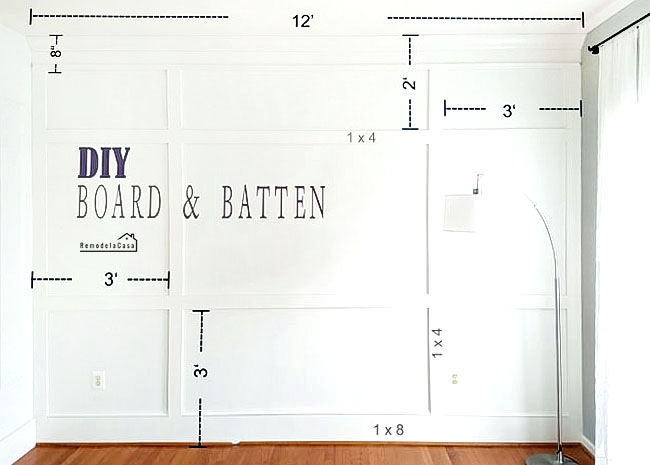
The solution: A board and batten treatment.
The sunburst mirror is perhaps, the same size as the other round sign that was there before.
However, it doesn't look that small because the subtle lines of the trim fill that big empty space.
And I don't think it looks busy.
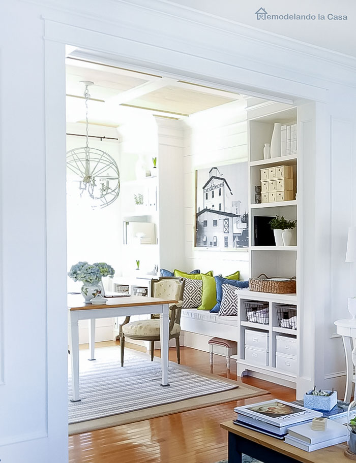
The second problem in this room, looking at this before picture, was the boring doorway.
And I don't think it looks busy.
The second problem in this room, looking at this before picture, was the boring doorway.
Those arrows were pointing at the missing crown molding, door trim, and tiny baseboards.
The other side of the room also sported a sad view.
Well, not anymore!
 |
| | Office - Dining Room Makeover | |
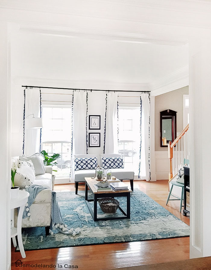
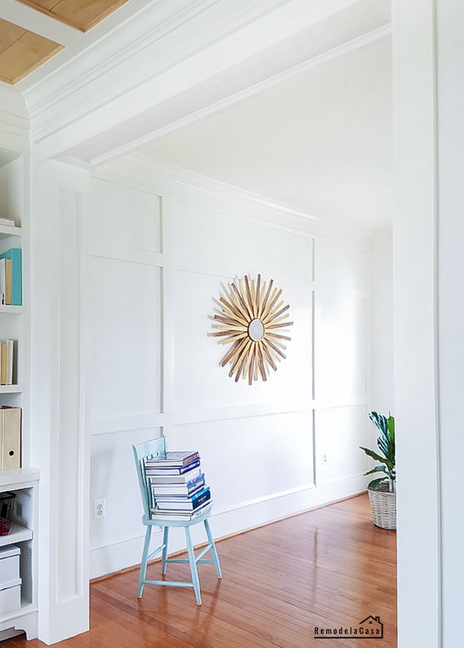
The solution: Trim, trim, and more trim!
Starting at the door, then the crown, and finally bigger baseboards.
The other side of the room also sported a sad view.
Well, not anymore!
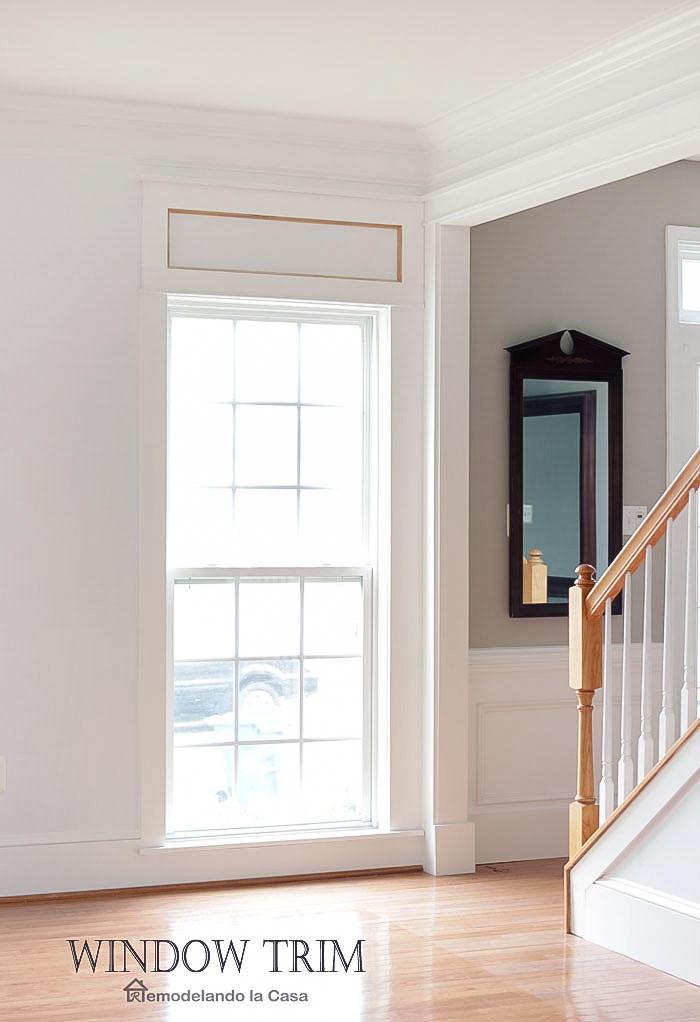
I also trimmed the windows and that passageway/door by the staircase.
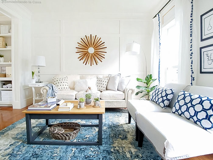
On this side of the room, the biggest change came by getting rid of that chunky chair...
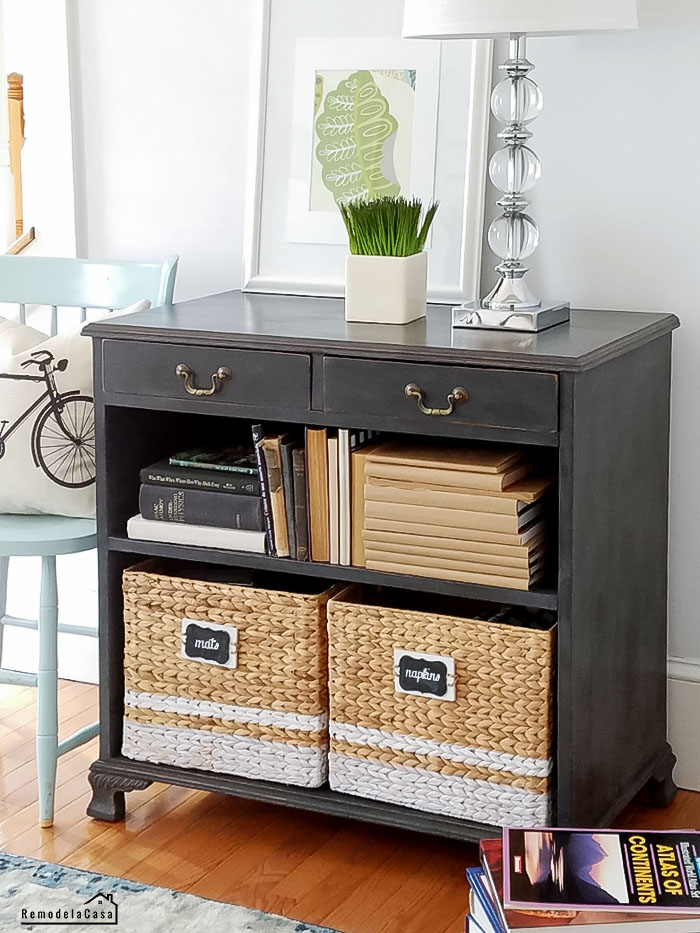
In its place, I brought this bookcase. I still need to bring a bigger piece of art to that small wall.
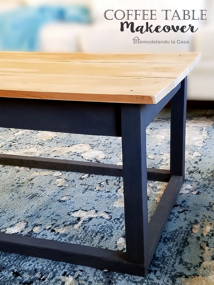
The coffee table and the area rug were the other items that needed an update.
Besides the need for updating the staircase and the art above the bookcase, I still need to add the quarter round all around both rooms, the living and dining rooms.
The mirror by the stairs is something else that I don't like, but that's going to be addressed when working on the foyer someday.
One more element that I believe this room needs is an overhead lighting fixture. I'm not sure at this point what kind of lighting fixture, but I'm definitely bringing one, the problem again, is when that might happen. :D
On this side of the room, the biggest change came by getting rid of that chunky chair...
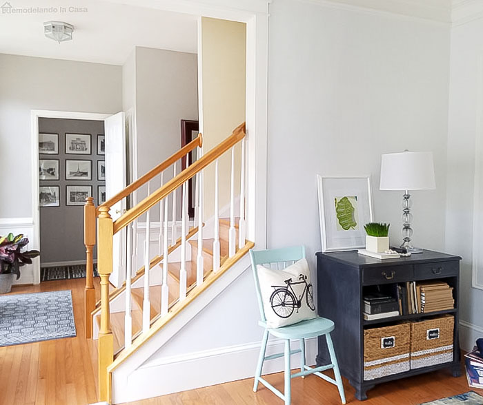 |
| | Bookcase | Baskets | Bicycle Pillow Case | Lamp - similar | |
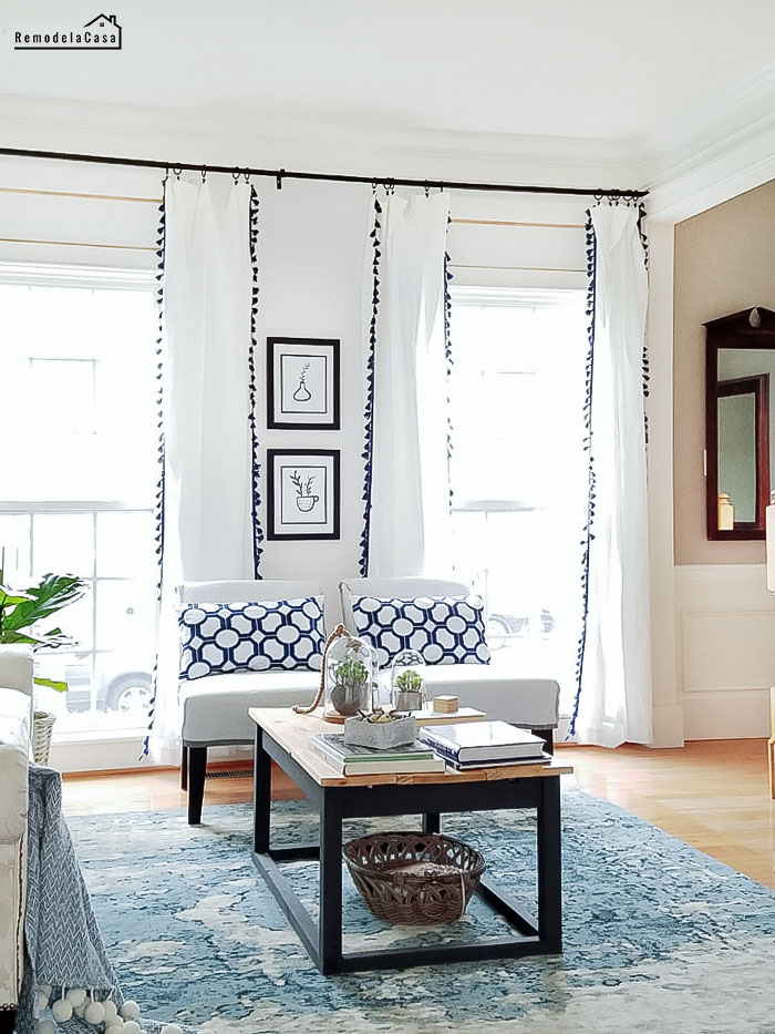 |
| | Curtains | Prints | Rug | |
 |
| | Terrariums | Rug | |
Besides the need for updating the staircase and the art above the bookcase, I still need to add the quarter round all around both rooms, the living and dining rooms.
The mirror by the stairs is something else that I don't like, but that's going to be addressed when working on the foyer someday.
One more element that I believe this room needs is an overhead lighting fixture. I'm not sure at this point what kind of lighting fixture, but I'm definitely bringing one, the problem again, is when that might happen. :D
Any suggestions will be appreciated.
Well, there you have it. One more room that's mainly done and that I can check off my to-do list. :)
I might do a similar post about the contiguous room, the now Home Office. You can check the reveal of that room during the holidays right HERE.
Check all the DIY projects completed in this room:
Well, there you have it. One more room that's mainly done and that I can check off my to-do list. :)
I might do a similar post about the contiguous room, the now Home Office. You can check the reveal of that room during the holidays right HERE.
Check all the DIY projects completed in this room:
*This post contains affiliate links for your convenience*





Looks great from every angle! You really have some good ideas and know how to implement them. Enjoy your beautiful new spaces.
ReplyDeleteSue P.
Thanks so much, Sue! You're such a sweet heart! I always appreciate your encoraugement. <3
DeleteOh my word, you add such fabulous architectural interest to a room with your talent. This looks amazing.
ReplyDeleteOh Marty, Thanks! Your words are music to my ears. I'm so glad you like it!
DeleteWow! What an incredible transformation. I love it! May I ask what color white you used in your living room? I am soon going to paint our living room white and am curious what you used. Keep up the good work. You are inspiring.
ReplyDeleteThanks Holly! I'm loving white paint these days, everything seems to pop against a white canvas.
DeleteFor the B&B wall I used Behr Swiss Coffee semi-gloss and satin finish. I always use Semi-gloss finish for the trim. So, the semi-gloss finish was used for the wood, the grid, crown, and baseboards. I used the same color, Swiss Coffee, but different finish for the wall in between grids: satin. The other walls were painted Behr-White - flat finish.
Thanks for stopping by and for your kind words. :)
LOVE everything! Girl, you have got to do your stairs....you will love it when it is done. Tape and tarp a little "tunnel" around them so you don't get dust and mess everywhere but it is doable! I envy that you have TWO sides to do!!!! BTW, my daughter was in you neighborhood this week. Spent spring break seeing DC! Loved it!
ReplyDeletehaha yeah, those stairs were calling me but I didn't have the time to tackle them! I've been working in the backyard and gotten some troubles with permits and change of plans. But, those steps would be the very next project. How fun that your daughter got to visit the DC area, there are tons of activities and places to visit there. I need to start planning which places I need to visit this Summer. You should plan a visit too. ;) Thanks for stopping by, Beck!
DeleteYour home should be featured in a before and after magazine Cristina! just WOW!
ReplyDeleteAwww you're just too sweet Vel, thanks!
DeleteCristina all that beautiful trim makes my heart go pitter patter! You are officially a carpenter with your mad skills. Just beautiful.
ReplyDeleteCristina, You did a wonderful job on that room. You gave it some real WOW factor with the board/batten look on the wall and the pumped up trim. It looks really fantastic now--even though it was pretty even before you touched it...lovely! xo Diana
ReplyDeletethe detail is amazing! Completely changes the look of your space!
ReplyDeleteI absolutely love all the trim work. the board and batten is to die for and definitely makes the room feel like a million bucks. I also like the subtle hints of patterns and colors in the room.
ReplyDeleteYou are amazing! Your new living room is just gorgeous!
ReplyDeleteYour home is gorgeous Cristina. I love the trim you added to the wall. I can't wait to see what you do with the stairs.
ReplyDeleteThis is absolutely gorgeous. I am forever in awe of the things you do! As a side note, I have a staircase just like that and it is ON. THE. LIST. Just as soon as I ever finish this darned kitchen.
ReplyDeleteCristina,
ReplyDeleteAll of the trim makes a dramatic difference, but the most eye-catching trim to me is the woodwork inside the large opening between the rooms. Your color scheme of blue and white pulls everything together. Super job!
Judith
It must be an absolute joy to sit in that room it is beautiful!
ReplyDeleteLove that wall! It looks great. The whole room looks so light and airy!
ReplyDeleteSimply stunning! I love how balanced everything looks now! You must sigh such happy sighs every time you enter these spaces!
ReplyDelete